 November
12
November
12
I built an interactive, dynamic poster for SfN 2015. Here’s why and how.
Editor’s note: a fully interactive version of this post is posted at the nipy plog on tumblr. This couldn’t be done here due to WordPress restrictions.
There are two parts to science, and both need verification.
There are two parts to science. First, science is the process of verifiable data collection. Second, science is the process of verifiable explaining of the data. In both steps, a key ingredient is: science must be verifiable. That is why “open science” is simply science–if you can’t verify the data collection nor analysis, then it’s not science.
This is one reason that science communication is so important: in addition to providing access to raw data and analysis scripts, opening one’s work up to verification requires communicating what you did, why you did it, and what the results are. The better these are communicated, the more easily other scientists can try to validate what was done.
Interactive visualization can help.
Most current visualization techniques fail this simple test. Many visualizations are there simply to tell the author’s story; they frequently aren’t rich enough for readers to look beyond that story and ask their own questions of the data. The farther visualizations take us from the raw data, the less likely it is that readers can think about alternative explanations or spot raw data errors.

It’s one thing to show a picture indicating that cortex is a 2D sheet that can be inflated; it’s another to allow people to examine that surface themselves and see mappings between inflated and curved surfaces. At the interactive version of this visualization, click and drag the two plots to examine how a 2D sheet can be folded; shift-click areas of the brain to see correspondences between inflated and wrinkled surfaces.
Interactive visualizations can also aid a deeper understanding of the data, while providing deeper access to the data. They allow us to explore raw values, examine correspondences between data points across plots, and zoom in for detail.
Publishing agencies have recognized that interactive visualizations can be more intuitive for readers to grasp a concept. The New York Times and Five Thirty Eight frequently post data-oriented news articles, which frequently include interactive visualizations. This fits with a growing body of research that suggest that manipulation and affordances affect people’s ability to understand concepts quickly and deeply.
For these reasons, interactive visualizations should be the standard in science. Forward-thinking science organizations such as F1000 and Society for Neuroscience have begun exploring dynamic and interactive visualizations in publications.
SfN helps to lead by introducing “dynamic posters”.
For the past few years, Society for Neuroscience (SfN; my favorite conference) has been experimenting with “dynamic posters”. Typically, posters are printed on large sheets of paper and presented on-demand during “poster sessions”. Dynamic posters are “posters” presented on a video screen rather than printed on paper. At SfN, 4 hour poster sessions have ~1200 posters; only a few of them are dynamic (around 10 per session), so SfN can be selective.

SfN is a huge conference with incredible numbers of posters; here’s about ¼ (not half) of a poster session at SfN 2015 in Chicago.
Unfortunately, SfN has done little to support their vision. There is no indication that selectivity for dynamic posters has anything to do with one’s actual use of “dynamic”–instead, it seems only based on the science. SfN also offers little guidance on how to use the technology, and zero working examples of dynamic posters to build from. Because of this, most “dynamic” posters turn out to be a static poster with a playable movie. This is a very impoverished use of the technology: more and more “static” posters simply use a tablet to show such movie content. SfN “dynamic” posters can aim higher, but largely do not.
My goal in this blog post is to share with you open source examples and templates of how I have begun to work with dynamic and interactive visualizations. Below you’ll find examples of my “dynamic” posters from the last two ideas, explanations of what I did and why, and links to open source repositories that contain all the code used to generate the plots shown.
My first dynamic poster: bridging poster and presentation from scratch.
Posters are designed so that people can walk up and get the basic ideas (What did you do? Why? What are the results?) on their own. The poster presenter is there for people who want to walk through the details.

Screen shots of my 2014 dynamic poster (default page & presentation mode). Most visualizations were static; the poster presentation itself was dynamic. Click to view the poster online.
Last year, I presented a dynamic poster at SfN. I used the “dynamics” of the poster to zoom in and out of content I presented, while keeping the basic information available to anybody (try it out!). This let me show my graphics and information at a larger scale. I also attempted to animate some of the graphics (e.g. how my neural network works), but these were relatively simple.
I created the poster using HTML/CSS/JavaScript and posted the open source project to Github. I used HTML/CSS/JavaScript so that it could be viewed on the web by anyone, anytime. I posted the source code so that others could search “SfN dynamic poster” and have a template they could use as a starting point. Yes, that’s right–SfN provides no guidance on “dynamic” posters, and provides no templates.
My second dynamic poster: migrating from dynamic to interactive.
Dynamic can be good, but interactive can be even better. My goal this year was to make my “dynamic” poster interactive. My data analysis was focused on left and right hemisphere differences on the size and thickness of the cortical sheet. Specifically, I compared how left/right differences in one part of the cortex predict left/right differences in other parts of the cortex. The data are fundamentally spatial, and the results may have a spatial component that is hard to understand without plotting them back onto 3D brain models. So my goal for this year was to show meaningful visualizations, share as much of the raw data as possible through interactive methods, and to use 3D brain models to both access and visualize the spatial nature of the data.
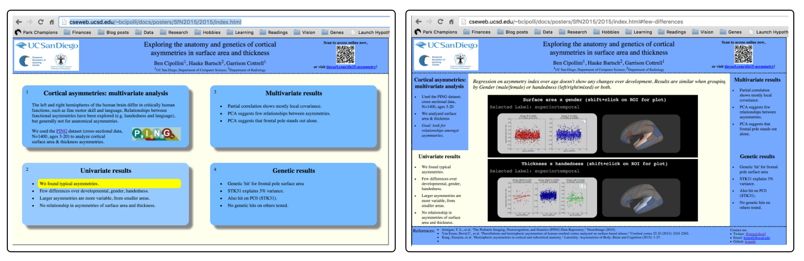
Screen shots of my 2015 interactive poster (default page & presentation mode). Click to view the poster online.
I didn’t know how to do any of this, but I new it is possible and that, with a bit of effort, I could figure it out. A “bit of effort” turned out to be 6 weeks of sleepless nights; I hope that by writing this blog post to share what I’ve created and learned, others could use the ideas or code to try their own interactive visualizations. The code for the poster is on GitHub, and I have a live version of this interactive poster on my website.
The Base: HTML/CSS + JQuery + Angular
The base of my poster is HTML/CSS/JavaScript–the language of the web. HTML defines the content of the page; CSS styles it. JavaScript controls most of the dynamics and interactivity. I used two very common libraries for the base dynamics. Just like last year, I used JQuery to hide and show parts of the poster, based on user navigation; this allowed me to maximize space for showing relevant plots.
This year, I used Angular.js to dynamically load content. I found that loading all the visualizations at once took forever. Angular.js is a powerful framework for dynamically loading content. I took the time to learn the framework via CodeAcademy.
I also embedded my visualizations using “IFRAME”s. An IFRAME is a HTML object; it’s a window embedded inside a webpage, showing another webpage. In fact, Twitter uses IFRAMEs to show tweets in webpages, just like you see above! So, each of the interactive visualizations is actually a separate webpage embedded into the poster. This avoided the complexity of running all the code from within the same webpage; some of the code could overlap and interact, and I wanted to avoid that. Using IFRAMEs allowed me to do that.
The Libraries: Interactive Plots via Python + Bokeh
I had a number of scatter plots and similarity matrices that I wanted to share. For each, I wanted users to be able to explore the raw data in each–to see the label and raw values for each data point.
All of my data analysis is in Python, so I tried a few different Python libraries for generating web-ready plots. I wound up using Bokeh, a powerful interactive graphics tool. Bokeh is really a JavaScript library, but there is a Python package for generating Bokeh plots in Python. This allowed me to avoid exporting my data and having to write JavaScript code; instead, I could define all the interactions directly in Python. Bokeh has facilities to do all sorts of interactivity, including making correspondences across plots.

Scatter plot of “asymmetry index” (size difference between left and right hemispheres) for 40 different regions of cortex. Click to view the interactive version of this plot. Note that using these interactive plots, each point can be labeled and raw values shown. Points that overlap can be viewed by zooming. Even choices in x and y axis ranges become clearer, as these values change with panning and zooming.
I also compared how asymmetry in one area of cortex uniquely predicts the asymmetry in each other area in cortex, after factoring out how well other parts of cortex have already predicted the two areas (i.e. partial correlation). I created a huge matrix to show these values. I tried ordering the labels to be spatially meaningful, but it proved to be difficult.

Partial correlation matrix of how asymmetry in one cortical area predicts that of in other areas. The standard is to show these values in a matrix. It is hard to order labels in a spatially meaningful way, and since the matrix is symmetric, each value is shown twice.
At the interactive version of this plot, each entry can be labeled and a raw value shown. This solves some of the problems of large matrices, but does not help with spatial layout information.
The Code: Interactive Brains via THREE.js and RoyGBiv
In order to show spatial relationships from the matrix above, I created an interactive visualization. If you select one area of cortex, the similarity to all other areas in cortex are shown in a second brain.

Click to see the interactive version of this visualization. Interactive graphic for displaying the matrix data from above. Select an area in the left brain (shift-click), and the corresponding row in the matrix is painted onto the right brain. The goal is to make the spatial relationships of the values clearer. After making this plot, it was clearer to see that asymmetry in one area tends to be negatively correlated with an anti-asymmetry in nearby areas. This was an interesting result, and also highlighted instances where asymmetry in two areas varied positively.
In order to do this, I worked with the RoyGBiv open source project, developed by Arno Klein and Anisha Keshavan at the OHBM Hackathon in Hawaii earlier this year. The code uses Three.js, a library that renders 3D visualizations using modern web browser’s efficient WebGL (web graphics library). RoyGBiv detects clicks on cortical areas and allows you to do anything with that click, including plotting more data about that cortical area.
I spent quite some time and effort to extend the RoyGBiv code, generalizing the code and creating a few different interactions. One of these includes the “master-slave” relationship shown above, where you can interact with one brain surface to see data painted onto a second brain surface.
I used this system for a number of visualizations. One that could not have been done otherwise was to show that asymmetry does not change between ages 3-20, regardless of cortical area, gender, handedneess. In static form, I could have shown one example plot, or a “meta-plot” that showed the lack of results over all plots. With an interactive plot, I am able to give access to all such plots, so that users can really explore the depth of the data.

For each brain area, asymmetry does not change from ages 3-20, even if split by gender (male, female) or handedness (right, left, mixed).
Visit the interactive version of this plot; hold shift and click on one brain region, and a plot should appear to the right indicating how “asymmetry index” (% difference between the left and right, shown on the y-axis) of that area varies with age (shown on the x-axis).
Other relevant libraries I examined
Other relevant libraries include:
- MPLD3 – a library for generating HTML versions from code using Python’s matplotlib. It’s easy to use and provides some (limited) interactivity–definitely better than posting images of plots.
- BrainBrowser – a well-developed surface brain viewer. I haven’t figured out if it can work with multiple cortical areas, nor how to program in the types of interactivity shown above.
- PyCortex – Does both volumetric and surface-based visualizations. I’m not sure how to use it for surface data, nor how to program in interactivity as shown above.
- Plot.ly – A well-developed plotting library that I haven’t checked out yet.
Looking ahead
After creating this poster, I found myself wanting to develop more interactive tools for others to use. Now, when I think “science communication”, I think beyond words–I think of how we can share data with people for them to understand and explore.
In the coming months, I will be working with a talented high school student to continue building these visualizations. I will also look to continue publishing about public data using these interactive graphs. Stay tuned for future posts about tools, data, and interactive visualization!

You must be logged in to post a comment.